
That’s why our latest UX improvements matter. They’re not dramatic additions, but thoughtful refinements - both functional and visual - that make the tools feel more reliable, more intuitive, and simply more pleasant to use.
A Modern Aesthetic: The Comfort of Rounded Geometry
Design is not just how something works, but how it feels to the eye. As part of our commitment to a modern, professional interface, we have introduced a more organic geometry throughout our products.
By implementing rounded corners, we’ve softened the interface. In a high-stakes environment where operators spend hours in front of dense data, these subtle curves reduce visual noise and cognitive load. It makes the UI feel approachable and modern, ensuring that the software feels like a sophisticated partner rather than a rigid tool.
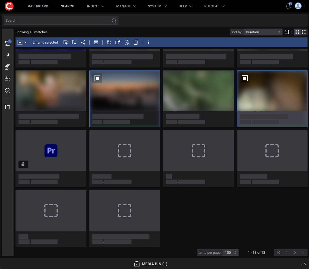
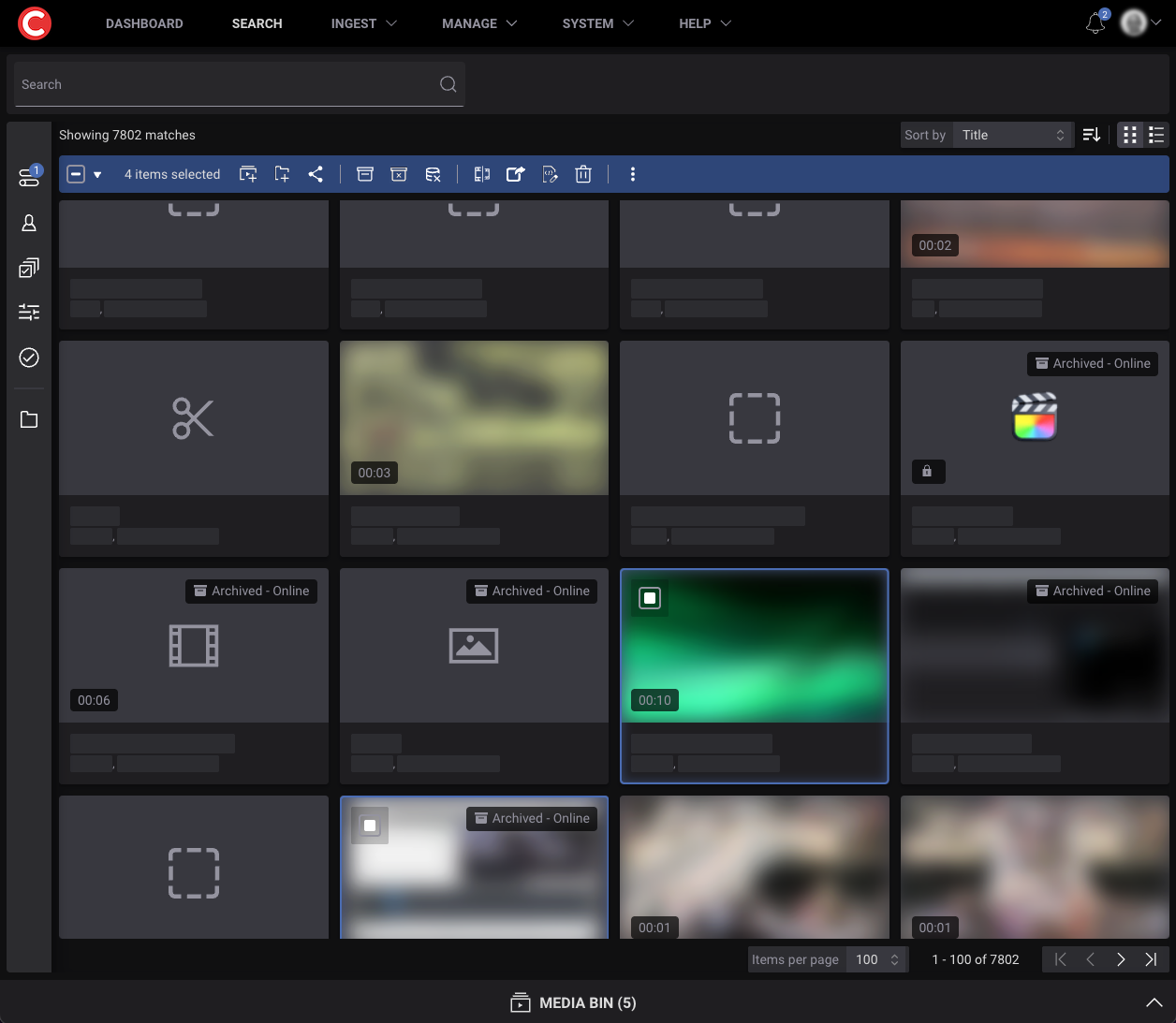
Improved Table Behaviour in Cantemo: Smoother Interaction, Better Focus
Cantemo relies on structured information: metadata, search results, asset lists, logs, history. Tables are at the heart of how users navigate and manage that information. So when a table behaves just slightly off — when scrolling jumps, when selection feels inconsistent, when editing interrupts your flow — the entire experience feels heavier than it needs to be.
Our recent updates focus on making table interactions more flexible and functional. Scrolling behaves the way you expect. Editing no longer pulls you out of rhythm. Navigating rows feels more stable and grounded. Combined with the updated visual language, these small adjustments accumulate into a noticeably calmer, more coherent user experience.
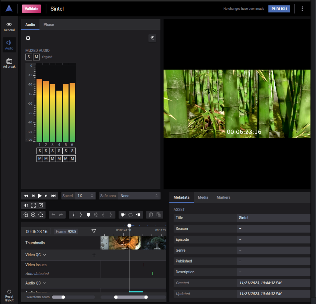
VU Meter + JIT in Validate: Restoring Real-Time Confidence
The VU meter in Validate is not new. It has been part of the experience for a long time — an essential visual cue for audio awareness during review or QC. But when JIT playback entered the picture, the meter didn’t fully keep up. With high-resolution files streaming directly from cloud storage, the VU meter couldn’t read the audio data properly, leaving it unresponsive.
Now, that gap is closed.
With this update, the VU meter works seamlessly with JIT playback. Audio levels once again respond in real time, giving operators the confidence and clarity they rely on when evaluating sound. It’s not a new feature — it’s an important restoration of the way the feature was always meant to work.
And that reliability is exactly what thoughtful UX demands.
Why These Improvements Matter: UX Shapes the Entire Workflow
When UX is well thought out, users don’t have to think about the interface at all. The behaviour of the UI becomes intuitive. Information becomes easier to interpret. The rounded, modern aesthetic creates a workspace that is as clear as it is functional.
That’s the philosophy behind these updates.
Not grand reinvention, but careful attention to the moments where users interact most: scanning tables, reviewing audio, navigating data, making decisions. These improvements may seem subtle from the outside, but their impact is felt with every click, every scroll, every second of playback.
Good UX is rarely loud.
Often, it’s invisible — which is exactly why it’s so powerful.
Looking Ahead: Designing for Clarity, Confidence, and Ease
As our products continue to evolve, UX and visual refinement will remain core drivers of that evolution. Whether it’s refining interaction patterns, improving clarity in busy interfaces, or ensuring that tools behave consistently across new technologies like JIT, our goal is simple:
✨Build systems that feel effortless
✨Support operators in the moments that matter
✨Let the user — not the software — stay at the center of the work
Because in the end, software for media professionals shouldn’t just be capable. It should be considerate.